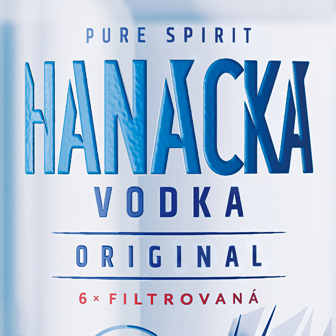
HANÁCKÁ VODKA
Brand redesign
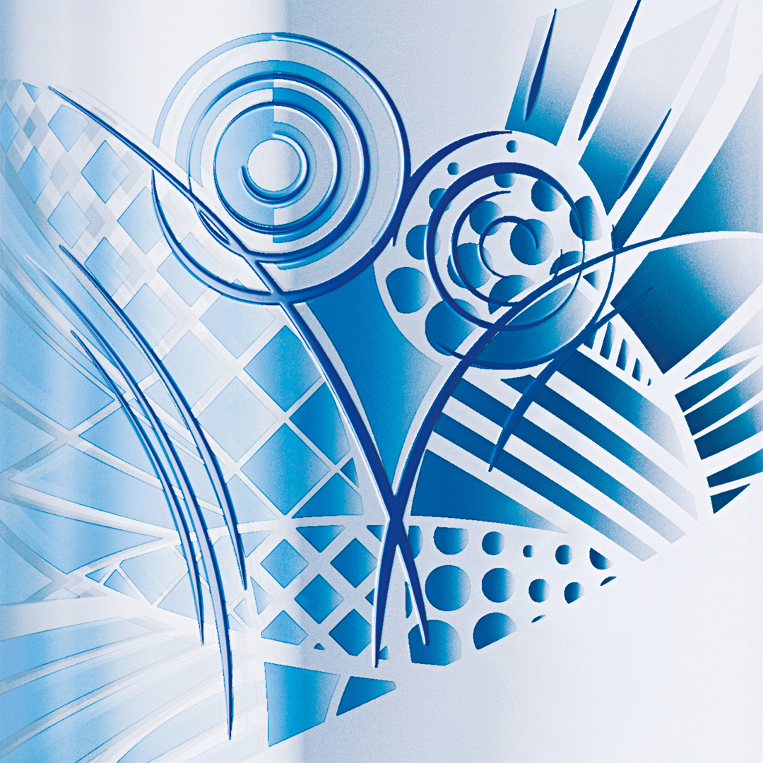
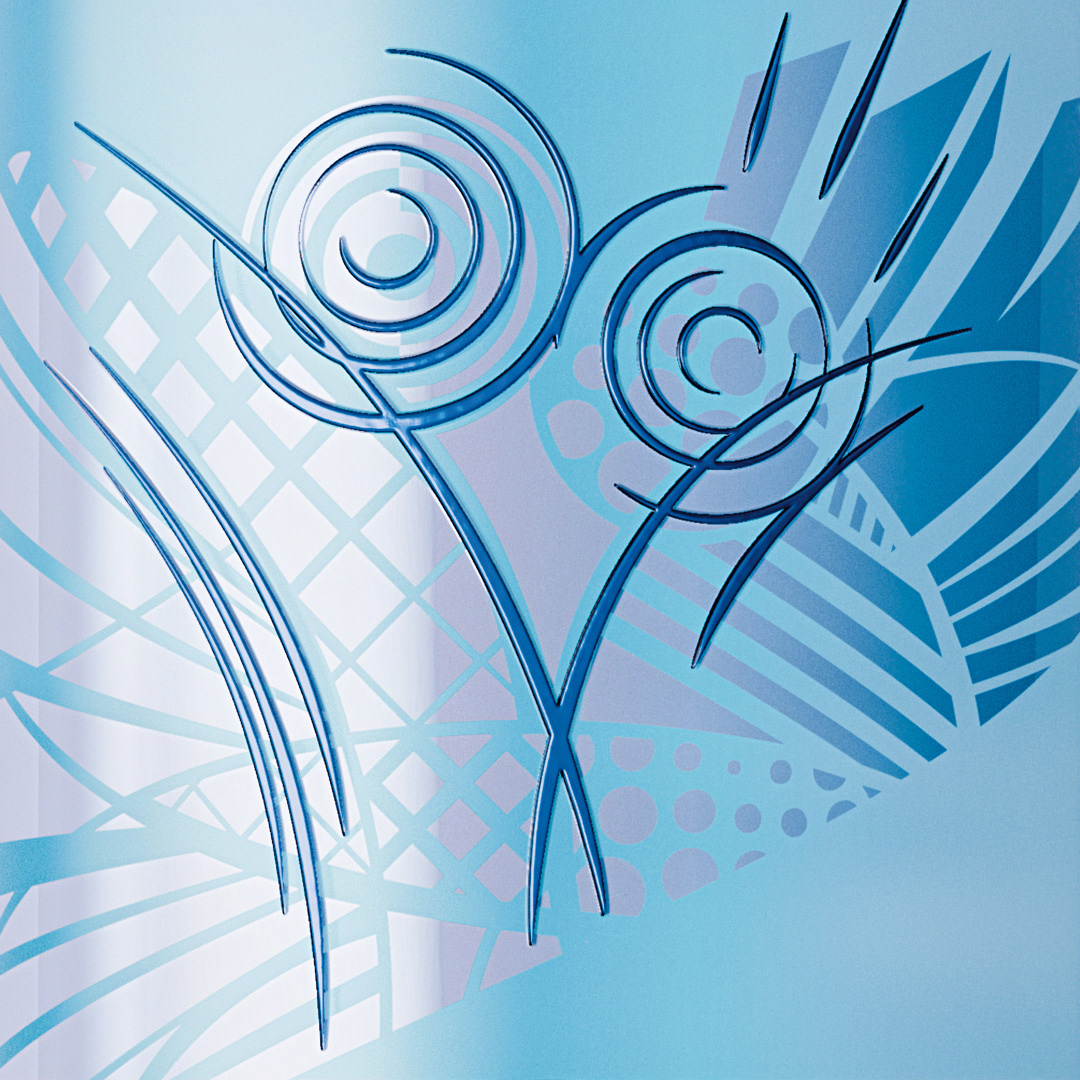
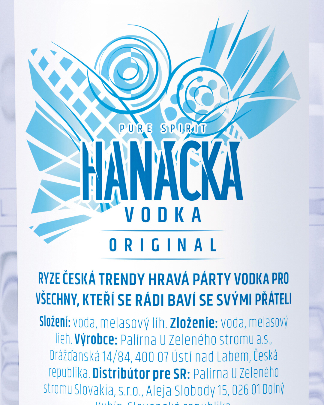
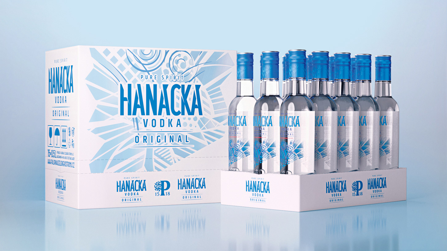
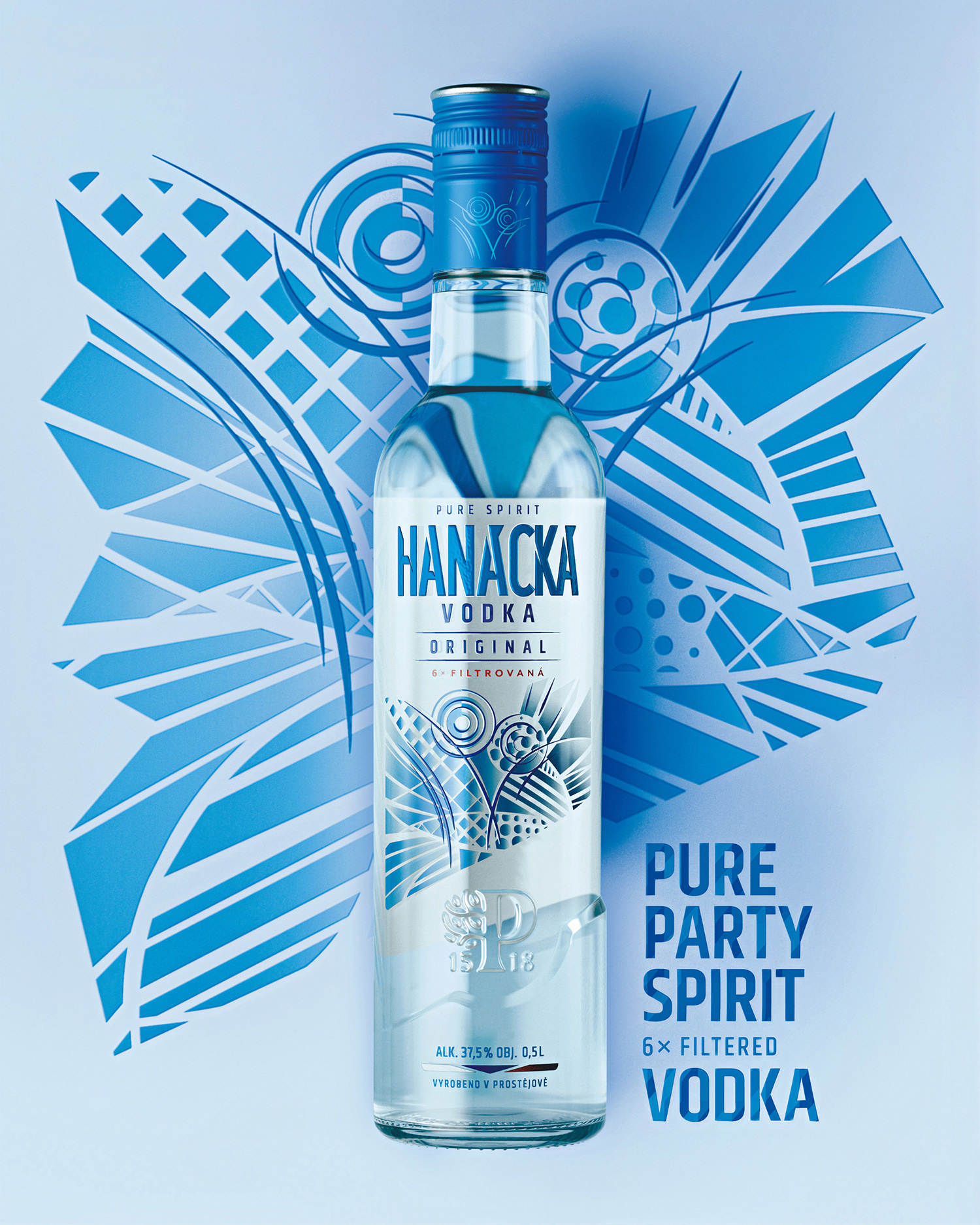
The target group of this brand are young and middle-aged people who go to parties, are trendy and look for quality. The producer decided to modernize one of its flagship brands after a long time, so the redesign is quite radical. It was important to create a new visual style relevant today. My work included redesigning the logo, label and bottle. The main motif is the dancing couple (party) in the illustration. The illustration is deliberately almost an abstract patern, so that it can be creatively applied to the supporting materials. The brand color is retained.
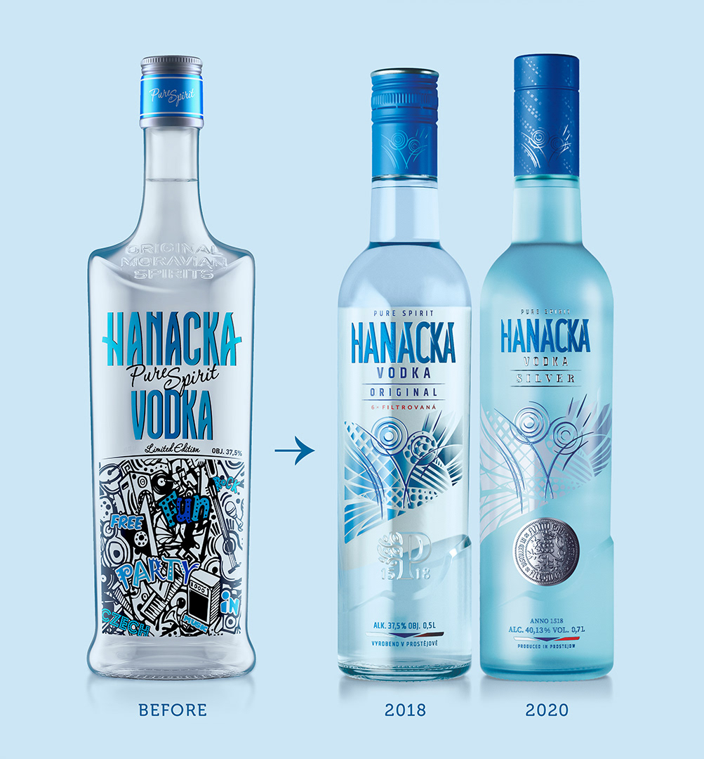
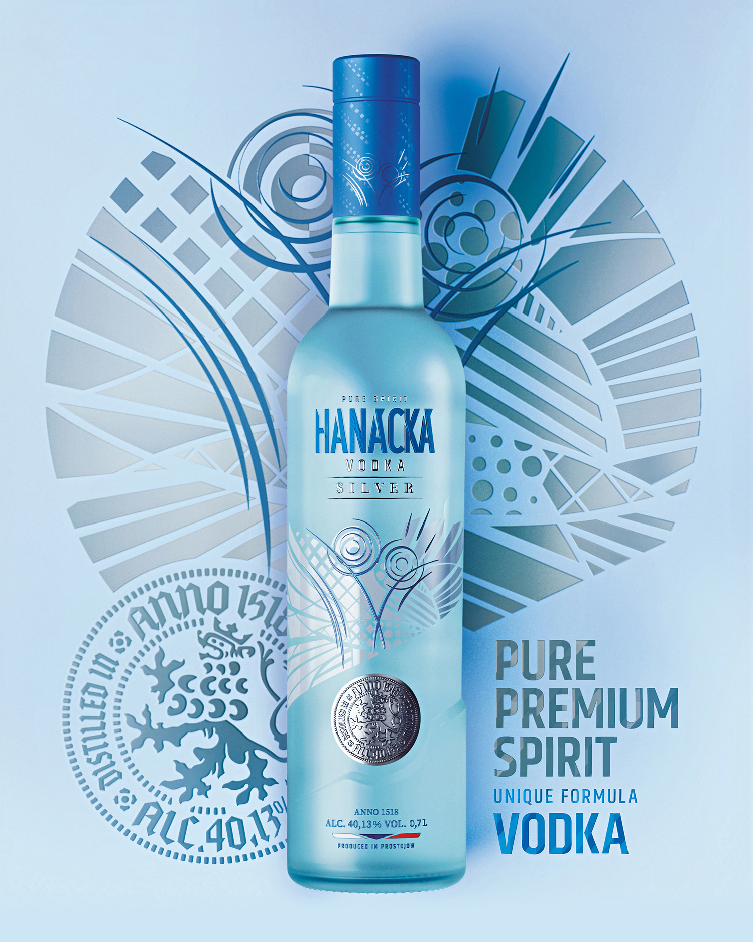
Original vodka was launched first, followed two years later by the premium Silver vodka. It is characterized by a unique production process based on the medieval practice of using the Prague silver groshen to measure alcohol content. Hence the name Silver, the metal coin on the bottle and the unique alcohol content - exactly 40.13%.
Client: Palírna U Zeleného stromu
Year: Original 2018, Silver 2020
Year: Original 2018, Silver 2020